
We were set a list of key typographic terms to define and illustrate ready for the next day. I found this an interesting task to research over night, these were all terms that we would have to get used to using and knowing what each of them meant. Some were covered briefly in class but most we had to research ourselves. I used the book ‘Thinking with Type’ to help me as well as searching online. I came across this useful blog which I think was a past students work but it helped explain many of them simply.
- Old Face – A traditional style characterised by contrasts in thick and thin strokes.

- Transitional – A type face with sharp forms and high contrast.

- Humanist – A style with a calligraphic variation due to it being based on humanist writers.

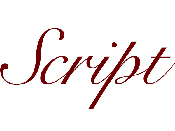
- Script – A varied and fluid style due to it being based on cursive handwriting.
- Roman – One of the three main kinds of historical type based on European scribal manuscript of the 1400’s.

- Italic – A slanted style of writing based on renaissance script.
- Majascule – A style characterised by being in all uppercase and the same height.
- Geometric – A generally sans serif type face based around geometric forms.
- Condensed – A term used in printing when the type is narrower than usual for its height.
- Ligature – Originating from the printing press days, it is when two letters are joined together.
- Slab Serif – This refers to type with square thick serifs.

- Clarendon – A popular style of bold face roman type.
- Triangular Serif – A type with serifs that are triangle shaped.
- Bifurcated Serif – A type where the serifs are split into two sections.
- Trifucated Serif – A type where the serifs are split into three sections.
- Vestigial – This is when a letterform has tails or flourishes etc. to make them appear dramatic.
- Fat Face – A inflated and hyperbold wide type style of exaggerated letter forms.
- Nesting – A way of using type as a design tool to fit a letter around another letter.
- Superior Letters – When a letter appears larger and superior due to the lowercase letters beside being made smaller and placed above the baseline.
- Versals Lombardic – A large decorated letter from the 13th – 6th century, typically hand drawn.
